3.13 Design mobile content to meet mobile users’ needs.
Many of the core design principles in this guide apply to mobile design as well as desktop, but there are some additional things to consider when designing on mobile.
Limit the number of elements on each screen.76
Keeping your design uncluttered is especially important for mobile users who are viewing content on a small screen. Simple screens enable users to find what they’re looking for more efficiently.
On mobile devices, the HHS.gov homepage features a simple search bar and 4 buttons, each linked to a secondary page.
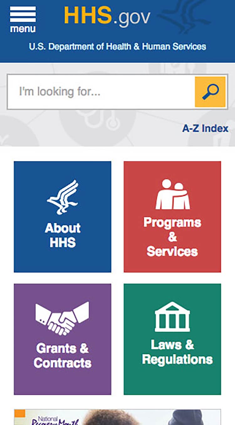
Source: https://www.hhs.gov/
Prioritize content and features at the top of the page.
Users spend the most time looking at content near the top of the page.77 Give limited space to elements users interact with at the top of the page—like buttons, menus, and links—so there’s room for content.78
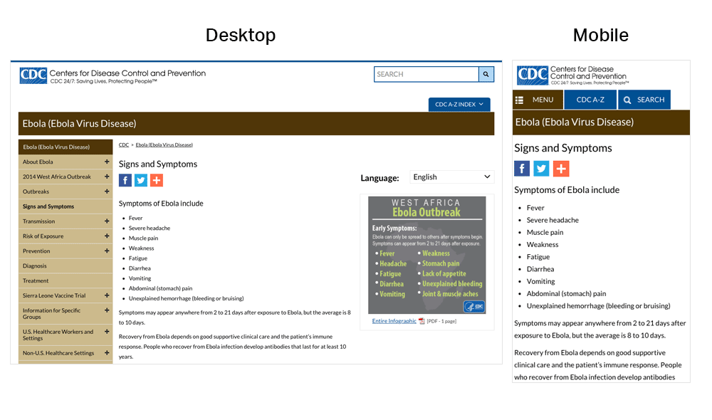
On mobile devices, the CDC website prioritizes important content at the top of the page—images and additional settings (like language preference) are at the bottom of the page.
Make interaction easy.
Mobile devices have smaller screens, so selecting a button or typing may be more challenging than on a desktop computer. Additionally, mobile interfaces can be challenging for users with physical conditions that affect their fine motor control (how precisely they can click or touch things).
With this in mind:
- Limit the amount of text your users need to type.20
- Use large buttons and tappable areas so that people using small devices can easily select them. Also be sure to include enough space around them.11,17
- Place frequently used buttons where they’re easy to reach. The easiest places to reach depend on the size of the device and how the user is holding it. In most cases, the center and bottom of the screen are easier to reach than the top.17,79
Users hold their phones in various ways, but the center and bottom of the screen are usually easiest to reach.
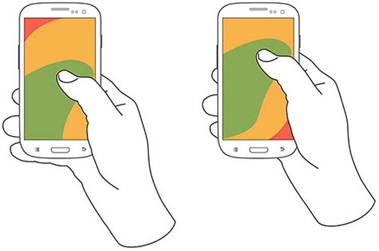
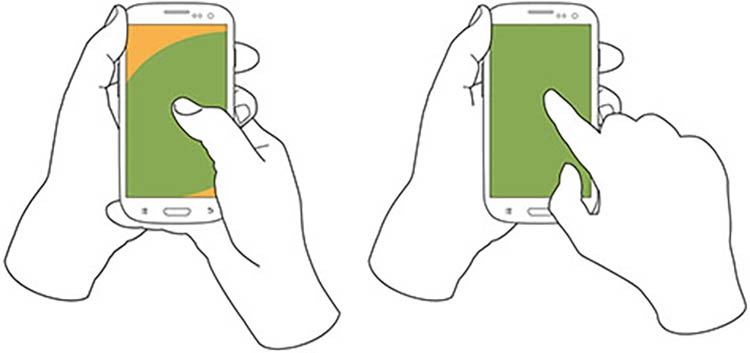
Source: Hoober, S. (2013). How Do Users Really Hold Mobile Devices? Retrieved from http://www.uxmatters.com/mt/archives/2013/02/how-do-users-really-hold-mobile-devices.php
- Try radio buttons. Limited-literacy users find large radio buttons the easiest way to make selections on a mobile device. Use them instead of checkboxes or interactive icons.
HealthCare.gov uses radio buttons for the answers to the question, “What do you want to do first?”
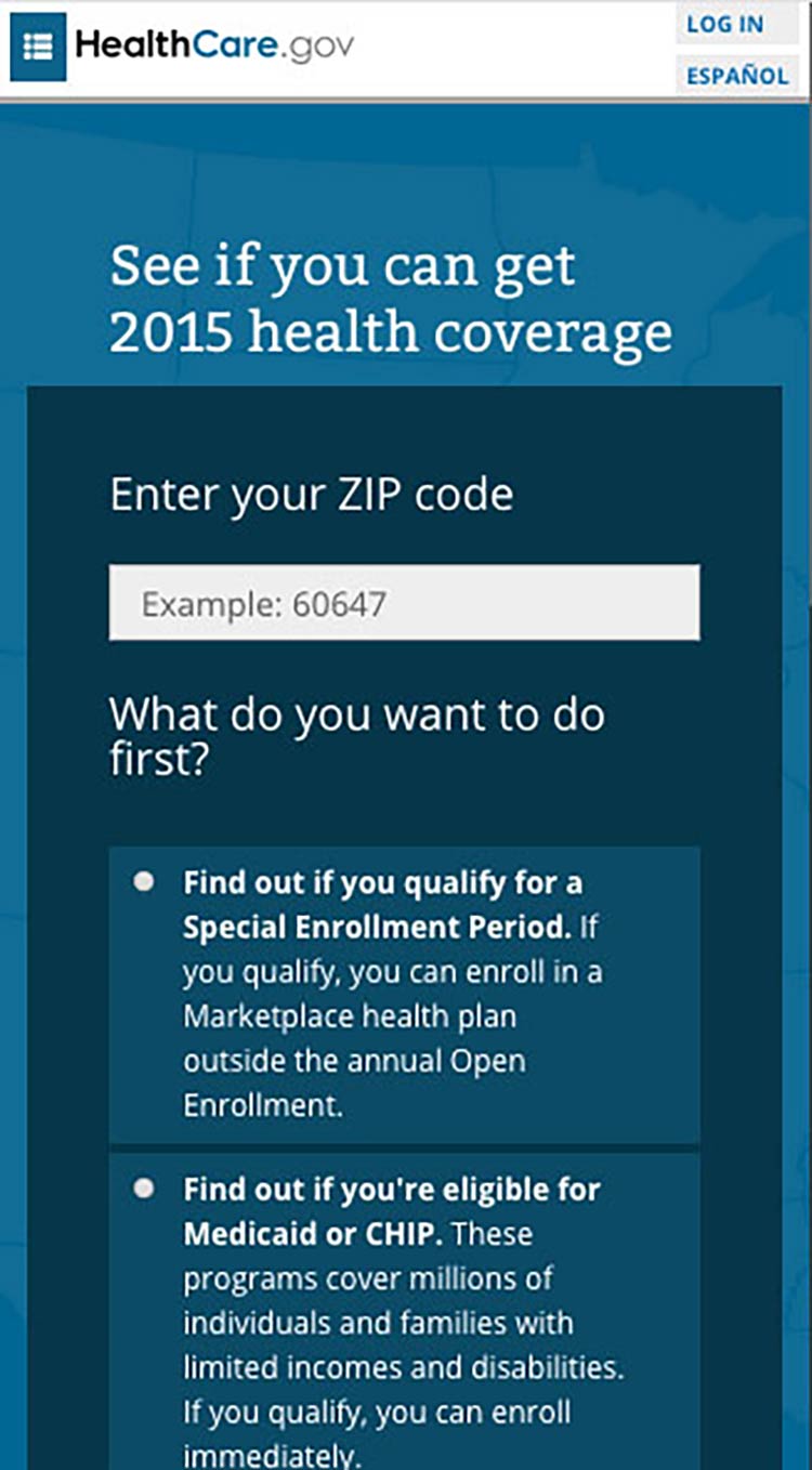
To improve “tappability,” be sure the label is associated with the radio button. That way, the label will be tappable, too—so users have a bigger area to tap.